Your branding is what matters to us most. We want to find the right products that’ll make your brand stand out and look its best. But, when it comes to your logo, we can’t just have any old image and run with it. If we did that, your branding could be compromised, and well, we’re just not about that.
With that in mind, we’ll only work with print-ready artwork files. This is because we want your branding and logo to be the best they possibly can be. But don’t worry, we’ll tell you exactly what you need to do, and what we need, before proceeding to order. That way, your brand will look its best every single time.
Your artwork & branding
What is artwork?
Your artwork is your logo, your branding, or whatever you want put on your merch. This can range from a one-colour text-based file to a full-colour wrap design. Whatever you want on your products, be it a picture, a logo or text, that’s what we call your artwork.
Pantones & CMYK
What’s my Pantone colour?
Put simply, each colour has its very own unique numeric code thanks to Pantone. This way, we can easily differentiate between say, a McDonald’s yellow and a Subway yellow. We want to make sure we print each colour in your artwork correctly, and the best way for us to do that is for us to know your Pantone colours.
This way, there’s no confusion with the printers. There’s no confusion about how colours appear differently on screens. There’s no confusion about different print techniques. Your Pantone colour is what makes your logo, well, yours.
What's CMYK?
CMYK is similar to Pantone, but instead of a unique code, these focus on the percentage of only 4 colours making up your particular colour. CMYK stands for:
- C: Cyan
- M: Magenta
- Y: Yellow
- K: Key (Black)
Sometimes, our printers can either only use Pantone, or only use CMYK. It depends on the product, and we’ll let you know which is needed.
What if I don't have a colour code?
Don’t worry! You can have a look at Pantone colours here, to work out yours.
What's best: CMYK or Pantone?
Pantone is more accurate than CMYK, as this colour is a unique code. CMYK, even if the same colour percentages are used, may have slight variations.
Where can I find my brand colours?
You can usually find your brand colours in your brand guidelines provided by your marketing team. It’s always good to have this on hand if you’re involved with branding, and if you send this across to your merchandise consultant at the point of ordering, we’ll make sure every aspect of your brand guidelines are followed.
Understanding your artwork file
Your artwork file
Your artwork file needs to be either an editable EPS/PDF/AI format that’s vectorised.
Image resolution
For printing, we need images that have a resolution of at least 300 dpi (dots per inch).
What if you don't have an artwork file?
No problem! Our studio team will be able to solve this for you. Just mention it to your merchandise consultant, and we’ll be happy to help.
What does it mean if your artwork file isn't outlined?
When we say your artwork isn’t outlined, we mean it isn’t vectorised. We need images, especially text, outlined in your artwork file because not all computers contain the same fonts, or read images the same way. If outlined, we can see exactly what it’s meant to look like.
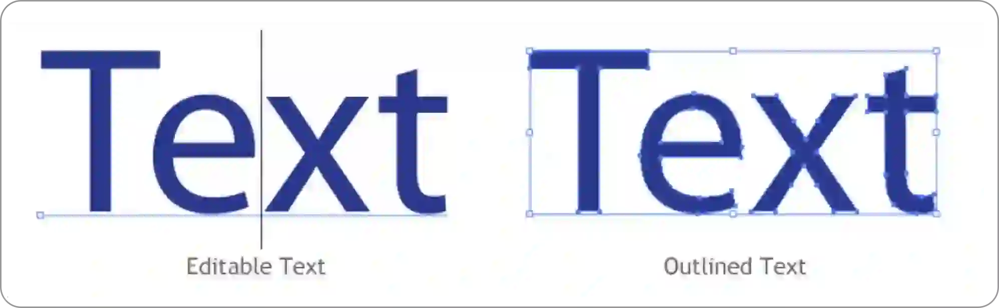
Understanding vector images
The amazing thing about vector images is that they are ‘drawn’ using maths! The image is set using mathematical points on an x and y-axis. This means that every minuscule aspect of your image has a unique code for its position. This allows for the image to be made larger or smaller without losing any clarity. A vectorised image keeps the integrity of your artwork, enabling a clean, crisp finish.
Understanding different branding techniques
Spot colour printing
Spot colour printing is the process of using 1, 2, 3 or 4 colours on an item. These are usually solid colours (so no gradients or ombre) and are usually used for simpler designs. These use Pantone colours.

Full-colour digital printing
This is for more complicated designs. It’s the reproduction of a digital image onto an item. Blends of colours, tones and gradients can be used. Digital print uses CMYK to create the colours needed.
Transfer printing
This is usually a full colour digital print that’s printed flat, then wrapped around an item, or transferred. Think of a reusable coffee cup - it would be very difficult for machines to print a design over the curved surface. Wraps allow for intricate designs look their best on curved surfaces.
![]()
Screen printing
Similar to spot colour printing, this method uses different screens to build up a design. It’s usually used for fabric items, like bags or clothing.
Pad printing
This is used to print 2D images onto 3D objects. It uses a rubber silicone pad to collect ink from an etched plate and transfer it to the product. This allows for lots of different products to be printed with spot colours.
Embroidering
This branding technique is used solely for fabrics. Strands are stitched using specialised equipment to create your chosen design. We usually use solid colours for this. We cannot match Pantones exactly to thread colours, but we can get a close enough match.
Engraving
This is a great branding technique for hard, flat surfaces. We use special lasers to engrave the material to a certain depth, which leaves a clean, crisp finish. We cannot print colours using this method, as the colour of the finished design is whatever the material is underneath. Engraving looks particularly impressive on wooden products.
Embossing
This is the act of creating a raised image on paper or material.
Debossing
This is the act of creating an indented image on paper or material. Usually used for branding notebooks. We use metal plates of your design and press into the product.
Checking your proof
When you receive your proof for your order, you need to make sure you check all aspects of the product and your logo are correct before approving it. This is because once you’ve approved your proof, your order will go into production and you cannot make any further changes.
In order to make sure your proof is 100% correct, you need to check the following:
1. Product- Is the product correct?
- Is the product colour correct?
- Is the product size (if applicable) correct?
- If a pen, is the ink colour correct?
- If a notebook, are the pages (lined, dotted, plain) correct?
- Has the correct artwork file been used?
- Are the Pantone/CMYK colours correct?
- Is the artwork in the correct position?
- If on a mug, is the handle on the correct side in regards to the branding?
- Is the artwork the correct size?
- Has the integrity of your logo been kept?
- Is all text spelt correctly?
If at any point something isn't correct with your proof, please let your customer service specialist know immediately.
We’re here to help
Artwork is at the core of what we do. Be it helping a start-up to define its brand, or creating elaborate festive gift campaigns. We know how important your brand is, and that’s why getting the perfect finish is important to us.
If you’d like any further information, or if you have any questions or queries, please don’t hesitate to get in touch.