Can you spot the hidden brand message?

Whether you've realised it or not logos are everywhere - literally! You may of not realised that some of them come with a hidden message - see! You learn something new every day...
Making a creative logo is always a tricky job let alone creating a logo to relay a message. But some of these clever designers have cracked it! - scroll down to take a look...
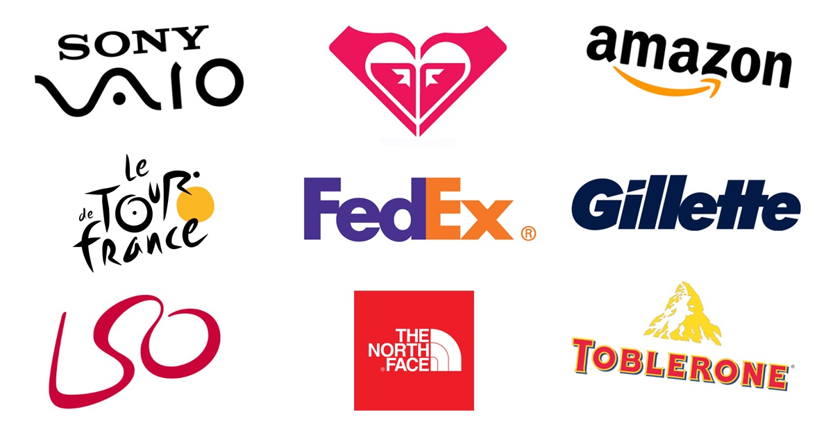
Take the Amazon logo for instance, some of you might have already noticed the orange arrow smile representing the smile on the customers face when they bought a product - cheeky! But you might not have noticed the arrow points from A to Z denoting that Amazon sell literally everything from A to Z!

Carefully designed Amazon logo and it's hidden message
Another popular one is the Fedex logo - if you haven't spotted it already look closely between the E and the X and you'll find the negative space creates an arrow representing what Fedex is all about, speedy delivery from one place to another - clever huh!?

The hidden arrow appears between the e and the x of the Fedex logo
One for a bit of history? Check out the Toblerone logo, it shows you where it all started in a city called Bern, Switzerland. A city famously associated with bears. Spotted it? It's in the mountains!

Is it a bird? Is it a plane? No it's a bear in the mountains!
How about The North Face logo, did you know it signifies a mountain? Yes, that's right its symbol represents the north side of Yosemite National Park's Half Dome mountain which by the way is the coldest and most treacherous side. The idea behind the brand was to create gear that would assist climbers in successfully traversing these conditions.

The North Face mountain logo and its hidden message
You're going to have to be sharp to get this one (Get it! - Gillette, razor, sharp?!). The hidden message in this one is in the ‘G' and the dot of the 'I', notice the diagonal razor sharp line that cuts across the ‘G' and the 'I' this represents the sharpness and precision of the Gillette razor.

The sharp slice represents the sharpness of the razor in the Gillette logo
Those creatives amongst you will have already noticed the link between Roxy and Quicksilver. Roxy is Quicksilver's female clothing line, the idea behind the logo was to reach out to the female market by using a heart. The heart has been made by rotating two Quicksilver logo's, how creative!

The hidden link between the Roxy and Quicksilver logo
This one's a bit more complicated... If you're a tech geek you might already know the symbols for analog and digital are presented in the Sony Vaio logo. It also spells out Vaio and symbolises the evolution and history of technology from analogue to digital!

Sony Vaio logo and it's analogue to digital representation
For something a bit more poetic take a look at the London Symphony Orchestra logo. Firstly you'll notice an acronym for the name of the company. Secondly the continual line represents fluidity of music but also it looks like a conductor conducting his musicians. If you can't spot it the straight line of the L represents the baton in the conductor's hand!

London Symphony Orchestra's conductor logo
Finally a logo known across the globe is the Tour de France logo with its bright yellow circle resembling the sun. But that's not all it represents look closely at the sun and you'll notice it doubles up as a bicycle wheel with the R and the dot symbolising the rider…got it?

The hidden cyclist within the Tour de France logo
When you're thinking about your next campaign, starting up a business or re branding, a hidden message is certainly something to consider. Whether it be emotive colours, symbolic shapes or strategic positioning it sure is a great way to illustrate what your business is all about.
Interested in speaking with the team?
If you'd like to discuss how Fluid can help you and your brand with merchandise campaigns, don't hesitate to get in touch. Simply pop some details in the form below, we'll be in touch shortly!

.jpg)